
The model came back at R² = 0.99 and the meeting ended. Nobody asked to see the scatter plot, because a number that high had already answered the question the plot would have raised. That reflex — read the summary, skip the picture — was named and demonstrated in a paper published in February 1973, and it has outlived every attempt to kill it.
The paper is Francis Anscombe's "Graphs in Statistical Analysis", The American Statistician 27(1):17–21. It opens by listing the beliefs it means to dismantle: "Few of us escape being indoctrinated with these notions: (1) numerical calculations are exact, but graphs are rough; (2) for any particular kind of statistical data there is just one set of calculations constituting a correct statistical analysis; (3) performing intricate calculations is virtuous, whereas actually looking at the data is cheating." His instruction is as blunt as instructions in statistics journals get: "Before anything else is done, we should scatterplot the y values against the x values and see what sort of relation there is—if any."
We will walk through that paper as printed and add what the usual retelling leaves out. The quartet's statistics are not actually identical, and how un-identical they are sharpens the lesson. The same error runs in reverse, through thirteen published data sets that all score R² ≈ 0.004 — one of them a dinosaur. And R² turns out to be a property of where you chose to look: one noiseless parabola hands you 0.9985 or 0.0000 depending on how wide the window opens. Everything below is either transcribed from a primary document or computed in a container on 25 July 2026, reproduced as captured, elisions marked ….

Four data sets, one printout
Anscombe's argument rests not on the quartet itself, but on what a regression summary structurally cannot contain. The four datasets are just the demonstration. From pages 18–19:
"All these various features that can so greatly change the significance we attach to a calculated regression are invisible if we see only the usual quadratic summaries—the regression line, the analysis of variance, the multiple correlation coefficient R²."
Invisible is meant literally. What a summary drops is not hidden behind the number; it is absent from it. He had already warned against the moment of relief when the arithmetic finishes: "we cannot therefore heave a sigh of relief when the regression calculation has been made …"
Then the table on page 19 — four fictitious data sets, eleven (x, y) pairs each, the first three sharing a column of x values. Below it, one block of output, printed once:
Number of observations (n) = 11
Mean of the x's (x̄) = 9.0
Mean of the y's (ȳ) = 7.5
Regression coefficient (b₁) of y on x = 0.5
Equation of regression line: y = 3 + 0.5 x
Sum of squares of x − x̄ = 110.0
Regression sum of squares = 27.50 (1 d.f.)
Residual sum of squares of y = 13.75 (9 d.f.)
Estimated standard error of b₁ = 0.118
Multiple R² = 0.667
His framing of that block is not the claim most people repeat: "Each of the four data sets yields the same standard output from a typical regression program, namely …" The same output from a typical program — not the same numbers. Here are the four, on shared axes, with the single line his summary describes.
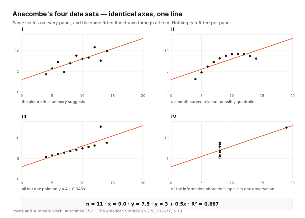
His own descriptions beat any paraphrase. Set 1 is "the kind of thing most people would see in their mind's eye, if they were presented with the above calculated summary". Set 2 "suggests forcefully that data set 2 does not conform with the theoretical description (A), but rather y has a smooth curved relation with x, possibly quadratic, and there is little residual variability". In set 3, "all but one of the observations lie close to a straight line (not the one yielded by the standard regression calculation), namely y = 4 + 0.346 x; and one observation is far from this line." And set 4: "All the information about the slope of the regression line resides in one observation—if that observation were deleted the slope could not be estimated."
That last one is not a figure of speech. Delete the point at x = 19 and the remaining ten all sit at x = 8; the sum of squares of x − x̄ becomes zero, and the slope is 0 ÷ 0. Set 3 is the mirror: drop its one high point and the survivors fit a line with R² = 0.999993, so one observation moved that set from 0.667 to essentially one.
The quartet gets treated as a teaching toy, so note that Anscombe's worked example was a real study. On page 20 he describes per-capita public school expenditure across the fifty US states, regressed on three predictors, with "multiple R² about 0.7 and well behaved residuals". Alaska's predictor values sat far from the rest. Omit Alaska and "multiple R² is reduced below 0.6." One state in fifty, and more than a tenth of the variance it claimed to explain went with it.
How identical is "identical"?
Reproduce the table exactly as printed, compute at full precision, and the familiar claim breaks. The four R² values are 0.66654, 0.66624, 0.66632 and 0.66671 — agreeing to two decimal places, no further.
docker exec w21rsq python /03-anscombe-precision.py
EVERY STATISTIC, ALL FOUR SETS, 17 SIGNIFICANT FIGURES
statistic                                           I                       II                      III                       IV
…
slope b1                          0.50009090909090914      0.49999999999999994      0.49972727272727274      0.49990909090909097
…
correlation r                     0.81642051634484003      0.81623650600024267      0.81628673948959807      0.81652143688850298
R^2                               0.66654245950877522      0.66624203372748414      0.66632404106655896      0.66670725689846555
…
R^2 across the four sets, full precision, and as Anscombe printed it (0.667):
  set I    R^2 = 0.66654245950877522   printed as 0.667
  set II   R^2 = 0.66624203372748414   printed as 0.666
  set III  R^2 = 0.66632404106655896   printed as 0.666
  set IV   R^2 = 0.66670725689846555   printed as 0.667

r across the four sets (Anscombe never prints r; 0.816 is sqrt(0.667)):
  set I    r   = 0.81642051634484003   printed as 0.816
  set II   r   = 0.81623650600024267   printed as 0.816
  set III  r   = 0.81628673948959807   printed as 0.816
  set IV   r   = 0.81652143688850298   printed as 0.817
  sqrt(0.667) = 0.81670067956381676
That corrects our own copy and much published copy elsewhere: the correlation coefficient usually quoted alongside the quartet appears nowhere in Anscombe's paper. He prints R² = 0.667 and stops. The familiar figure is the square root of that, and not even a stable rounding — set IV's correlation is 0.81652, which rounds to 0.817.
This strengthens the lesson. Anscombe's wording was exact: at the precision a 1973 regression program printed, and at the precision anyone reads today, the four are indistinguishable.

"R² Is Not Enough!" is NIST's heading, not ours
This is not just a curiosity from an old journal. The point is now enshrined in a US government standards handbook, exclamation mark and all — NIST/SEMATECH's e-Handbook of Statistical Methods, §4.4.4, sub-headed "R² Is Not Enough!":
"Model validation is possibly the most important step in the model building sequence. It is also one of the most overlooked. Often the validation of a model seems to consist of nothing more than quoting the R² statistic from the fit (which measures the fraction of the total variability in the response that is accounted for by the model). Unfortunately, a high R² value does not guarantee that the model fits the data well. Use of a model that does not fit the data well cannot provide good answers to the underlying engineering or scientific questions under investigation."
That parenthesis is the definition worth adopting, because it is modest in the right place: variability accounted for by the model is a statement about this model against this data, not about the world. The handbook then names the working alternative: "There are many statistical tools for model validation, but the primary tool for most process modeling applications is graphical residual analysis." Numerical methods stay useful but subordinate, because they "often try to compress that information into a single descriptive number or test result." Anscombe got there first, with his own list of what a residual plot shows and a summary cannot.
§4.4.4.1 supplies the sentence that keeps the argument honest, and it cuts our way too: "Of course, just as the R² statistic cannot justify a particular model on its own, no single residual plot can completely justify the adoption of a particular model either." No plot is a certificate. A plot only shows you what a number cannot.

Thirteen shapes, R² = 0.004, and one of them is a dinosaur
The modern extension is Justin Matejka and George Fitzmaurice's "Same Stats, Different Graphs" (CHI '17), from Autodesk Research. Their method generates data sets "through random perturbations of individual data points" steered by "a simulated annealing optimization strategy", "agnostic to the particular statistical properties that are to remain constant". Where Anscombe published four fictitious sets, they can manufacture any number, in any shape.
The published result is the Datasaurus Dozen: thirteen sets of 142 points. We pulled two independent copies — OpenIntro's redistribution and CRAN's datasauRus 0.1.9 — and checked them against each other before computing anything.
docker exec w21rsq python /06-datasaurus.py
…
CROSS-CHECK: OpenIntro CSV vs CRAN datasauRus .rda
…
  away       n= 142  identical point-for-point: True
  bullseye   n= 142  identical point-for-point: True
…
  x_shape    n= 142  identical point-for-point: True
  ALL THIRTEEN DATASETS BYTE-IDENTICAL ACROSS THE TWO SOURCES: True

…
SPREAD ACROSS THE THIRTEEN (this is the paper's claim, quantified):
…
  mean x     min=   54.260150  max=   54.269927  spread= 9.777e-03  identical to 1 dp
  mean y     min=   47.830252  max=   47.839829  spread= 9.577e-03  identical to 1 dp
  sd x       min=   16.760013  max=   16.770000  spread= 9.987e-03  identical to 1 dp
  sd y       min=   26.930002  max=   26.939998  spread= 9.996e-03  identical to 1 dp
  corr r     min=   -0.069446  max=   -0.060341  spread= 9.104e-03  identical to 1 dp
  R^2        min=    0.003641  max=    0.004823  spread= 1.182e-03  identical to 2 dp
…
WHAT OUR TOOL WOULD SAY ABOUT EACH (same thresholds as app.js:174-185):
…
  bullseye   |r| = 0.069  ->  'No meaningful correlation', R2 = 0.5% of variance explained
  circle     |r| = 0.068  ->  'No meaningful correlation', R2 = 0.5% of variance explained
  dino       |r| = 0.064  ->  'No meaningful correlation', R2 = 0.4% of variance explained
…
  star       |r| = 0.063  ->  'No meaningful correlation', R2 = 0.4% of variance explained
…
Thirteen data sets agreeing on n, both means, both standard deviations and the correlation. None of the thirteen is a random cloud: each was steered, point by point, toward a target shape.
This is the same error in reverse. The twin fallacies—"R² is high, so the model is right" and "R² is near zero, so there is nothing there"—share one premise: that the statistic knows the shape of the data. It does not. Pearson's r detects straight lines and nothing else, so a circle, a dinosaur and a structureless cloud all score about zero.
Rank correlation widens the net, but only in one direction. Spearman's ρ is Pearson's r computed on ranks, so a monotone curve escapes: take y = x³ over thirty points and ρ comes back at exactly 1.0000 while r reads 0.9201 and R² only 0.8466. Our correlation calculator prints the two side by side for that comparison. It does not rescue the dinosaur. Rank the points of a closed shape and they still rise and fall — the circle in that list returns ρ = 0.009. A second coefficient buys you monotonicity, not shape.
That last transcript block — our own thresholds, applied to a dinosaur, returning "No meaningful correlation" — sent us back into the tool's source.
R² is a property of your sampling window
The demonstration we find most uncomfortable needs no outlier, no noise and no exotic shape. Take a process with an optimum — yield against temperature, revenue against price. We used y = 100 − 4(x − 25)² / 10, a parabola peaking at x = 25, observed with zero noise, so every departure from a straight line is model error.
Observe only x from 5 to 15, the left flank, and least squares returns y = −113.6111 + 12.0000x with R² = 0.9921. Our own calculator calls that a very strong linear correlation, and by conventional standards it is a superb fit. It is also a line, and a line has no maximum: it says y climbs for ever. At x = 40, where the truth has fallen to 10.00, it predicts 366.39.
Now widen the window. Same physics, same model, same procedure — the only change is how much of the process we looked at.
| Observation window | R² | What our calculator calls it |
|---|---|---|
| x from 5 to 10 | 0.9985 | Very strong linear correlation |
| x from 5 to 15 | 0.9921 | Very strong linear correlation |
| x from 5 to 20 | 0.9748 | Very strong linear correlation |
| x from 5 to 25 | 0.9329 | Very strong linear correlation |
| x from 5 to 30 | 0.8336 | Very strong linear correlation |
| x from 5 to 35 | 0.6072 | Strong linear correlation |
| x from 5 to 40 | 0.2211 | Moderate linear correlation |
| x from 5 to 45 | 0.0000 | No linear relationship |
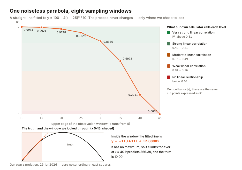
R² walked from 0.9985 to 0.0000 without one thing about the world changing. It describes the relationship between your model and the slice you happened to collect, not the one between x and y. Narrow the range and almost anything smooth looks linear — the ordinary condition of observational data.
Why R² can only ever go up
Another structural fact encourages misusing R²: adding a predictor can never reduce it. The new column can take a coefficient of zero, reproducing the old fit exactly, so least squares never does worse — and in practice does a little better by chance. We took one real signal and added nineteen columns of junk, one at a time.
docker exec w21rsq python /07.py
RNG: numpy default_rng, SEED = 20260725

(a) ONE REAL SIGNAL, THEN 19 COLUMNS OF PURE NOISE. n = 40.
…
     k predictors          R^2   adjusted R^2        SSres   R^2 rose?
                1     0.613566       0.603397     159.0879           -
…
                5     0.664886       0.615605     137.9603         yes
…
               10     0.714312       0.615800     117.6124         yes
…
               15     0.747328       0.589408     104.0205         yes
…
               20     0.771487       0.530947      94.0747         yes
…
    R^2 never fell. Adjusted R^2 peaked and then fell, which is the whole
    point of it: it charges a price for each predictor.

(b) NO SIGNAL AT ALL. y is pure noise, every predictor is pure noise,
    and none of them has any relationship to y by construction.
    n = 30 observations.
     k predictors          R^2   adjusted R^2
                1     0.001272      -0.034396
…
               10     0.369497       0.037653
…
               20     0.777639       0.283504
…
               29     1.000000            nan
…
R² rose at every one of the nineteen steps, from 0.613566 to 0.771487, while adjusted R² peaked around eight predictors and fell away after — which is what adjusted R² is for. Part (b) is the limiting case: twenty-nine predictors of pure noise on thirty observations of pure noise, and the model explains 100% of the variance.
The classic citation for this family of results is David Freedman's 1983 note "A Note on Screening Regression Equations" in The American Statistician. Its full text is paywalled and we did not read it, so we cite it for provenance only: every number above is from our own run, seeded 20260725, and none of it is his.
One more figure from that run ought to change reporting habits. From fifty candidate predictors of pure noise and a hundred observations of pure noise, keeping the ten with the strongest marginal correlation and refitting produced R² = 0.2895 — a result that reads as modest, honest social science. The screening step manufactured it, and the screening step is what disappears from the write-up. The American Statistical Association's guidelines cover this in Principle B: be "transparent regarding a priori versus post hoc objectives and planned versus unplanned statistical practices". An undisclosed search is the difference between a finding and an artefact.
What no computed number can tell you
All of that concerns whether a model describes its own data. People then take a further step without noticing, from "this line fits" to "this causes that" — the same mistake in a new place: a computed quantity asked to certify something the data cannot contain. Austin Bradford Hill put the general form of it in 1965, in "The Environment and Disease: Association or Causation?":
"No formal tests of significance can answer those questions. Such tests can, and should, remind us of the effects that the play of chance can create, and they will instruct us in the likely magnitude of those effects. Beyond that they contribute nothing to the 'proof' of our hypothesis."
That sentence is quoted as reproduced in Richard Wakeford's 2015 commentary in the Journal of the Royal Society of Medicine, 108(1):4–6, open access; Hill's own paper sits behind a bot challenge we did not work around. Read "R²" for "formal tests of significance" and nothing else needs changing. A statistic speaks to the play of chance inside its own sample. It cannot tell you the model is right.
Our calculator, and what we fixed today
We audited our own linear regression and correlation calculator against every source above, by running the shipped file rather than reading it. It did not pass. Three answers were wrong in ways that mattered; all three are repaired as of today, 26 July 2026.
docker run --rm --network none -v <repo>/public/tools/linear-regression-calculator/app.js:/app.js:ro -v <scratch>/04-tool-harness.js:/h.js:ro node:22-alpine node /h.js
…
================ DEGENERATE INPUT 1: zero-variance x ================
Eleven points on a perfectly vertical line. x never varies, so the
slope is undefined and r is undefined (0/0), not "random".
…
  equation   = y = —x + —
…
  r          = —
  r2         = —
…
  advisory   = ❌ No meaningful correlation (|r| = —). The relationship is essentially random.
…
================ DEGENERATE INPUT 2: n = 2 ================
Two points. Any two points lie exactly on a line, so R^2 is 1 by
construction and carries no information whatsoever.
…
  r          = 1.00
  r2         = 1.00
…
  advisory   = ✅ Very strong correlation (|r| = 1.00). R² = 100.0% of variance explained.
…
Eleven points on a perfectly vertical line describe a completely deterministic relationship. The tool called it essentially random. Nothing guarded against zero variance in x, so slope and correlation came back NaN, every threshold comparison failed, and control fell through to the last branch — printing the opposite of the truth beside a broken equation reading y = —x + —. A horizontal line hit the same dead end for a different reason: with no variance in y, r is 0 ÷ 0. Both now return an explicit state naming the assumption that ran out.
With two points, the tool reported "R² = 100.0% of variance explained". That is arithmetic, not evidence — any two distinct points lie exactly on a line, so R² = 1 is settled before you look at the data. It now withholds r and R² at n = 2 and says why: no residual degrees of freedom, nothing left to measure the fit with. Nor does the low-correlation branch still say "essentially random".
Two more, stated plainly because a page about not overclaiming has no business overclaiming. The metadata advertised a residual plot the tool did not compute, and the FAQ told readers to diagnose curvature with a control the page never provided. The privacy note promised "zero outbound requests", which was false; the copy now makes the claim that was always true — your pasted data never leaves the browser.
To its credit, the tool survived this audit better than its advisory text did. It always drew the scatter plot and fitted line on every keystroke. The picture was there; the words above it were the problem.
The residual plot now exists, so you can test this guide's argument yourself. Paste Anscombe's second data set in: the numbers say R² = 0.6662 and "Strong linear correlation", while the panel underneath draws the smooth parabola those statistics conceal — the whole paper, in a browser tab, on the eleven points that made the case in 1973.
Anscombe closed with a complaint about the software of his day: "The user is not showered with graphical displays. He can get them only with trouble, cunning and a fighting spirit. It's time that was changed." The trouble and the cunning are gone. What survives is the habit of not looking.
FAQ
Are Anscombe's four data sets really statistically identical?
Not exactly. At full precision the four R² values are 0.66654, 0.66624, 0.66632 and 0.66671, agreeing to two decimal places. Anscombe's own claim was narrower and correct — each set "yields the same standard output from a typical regression program, namely …" — the one summary block he printed. They collide at printed precision, which is the only precision anyone reads.
Does a high R² mean the model is right?
No, and a standards handbook says so outright. NIST/SEMATECH §4.4.4 is sub-headed "R² Is Not Enough!" and states that "a high R² value does not guarantee that the model fits the data well". R² knows nothing about whether the functional form is appropriate, and nothing about data you have not collected.
Why did R² go up when I added a variable that shouldn't matter?
Because it always does. A new predictor can take a coefficient of zero, reproducing the previous fit exactly, so least squares never does worse and in practice does slightly better by chance. In our run, nineteen columns of pure noise raised R² at all nineteen steps. Report adjusted R², which charges a price per predictor, and expect it to peak and then fall.
My R² is close to zero. Does that mean there is no relationship?
It means there is no straight-line relationship. All thirteen Datasaurus Dozen data sets score R² ≈ 0.004, and their shapes include a circle, a bullseye and a dinosaur. Look at the scatter plot first; if it shows a pattern, the answer is a different model, not "no relationship".
- Anscombe, "Graphs in Statistical Analysis" — The American Statistician 27(1):17–21, Feb 1973 (pp.17–21 read from the JSTOR scan) (accessed 25 Jul 2026)
- "How can I tell if a model fits my data?" (§4.4.4, "R² Is Not Enough!") — NIST/SEMATECH e-Handbook of Statistical Methods (accessed 25 Jul 2026)
- "How can I assess the sufficiency of the functional part of the model?" (§4.4.4.1) — NIST/SEMATECH e-Handbook of Statistical Methods (accessed 25 Jul 2026)
- Matejka & Fitzmaurice, "Same Stats, Different Graphs" — CHI '17, Autodesk Research (accessed 25 Jul 2026)
- Datasaurus Dozen data (13 × 142 points) — OpenIntro redistribution, cross-checked byte-for-byte against CRAN datasauRus 0.1.9 (accessed 25 Jul 2026)
- Wakeford, "Association and causation in epidemiology" — J R Soc Med 108(1):4–6, Jan 2015 — source of the Bradford Hill (1965) quotation reproduced here (accessed 25 Jul 2026)
- Ethical Guidelines for Statistical Practice, Principle B: Integrity of Data and Methods — American Statistical Association, 2022 (accessed 25 Jul 2026)
- Freedman, "A Note on Screening Regression Equations" — The American Statistician 37(2):152–155, 1983 — cited for provenance only; full text paywalled and not consulted (accessed 25 Jul 2026)

View author profile → · Editorial policy