The common question — is flying or driving worse for the climate? — gets confident answers in both directions. Most are wrong because they compare numbers in different units.
We ran a comparison for a route where both are a real choice, Singapore to Kuala Lumpur, using the engine from our own calculators.
The units problem, which is the whole problem
A flight is measured per passenger-kilometre. Our engine puts an economy seat at 0.158 kg of CO₂ per passenger-kilometre.
A car is measured per vehicle-kilometre, at 0.17 kg. That figure does not change when somebody else gets in.
Setting 0.158 against 0.17 and declaring a winner is the error. One figure is already divided by the number of passengers and the other is not. The comparison is meaningless until you specify how many people are in the car.
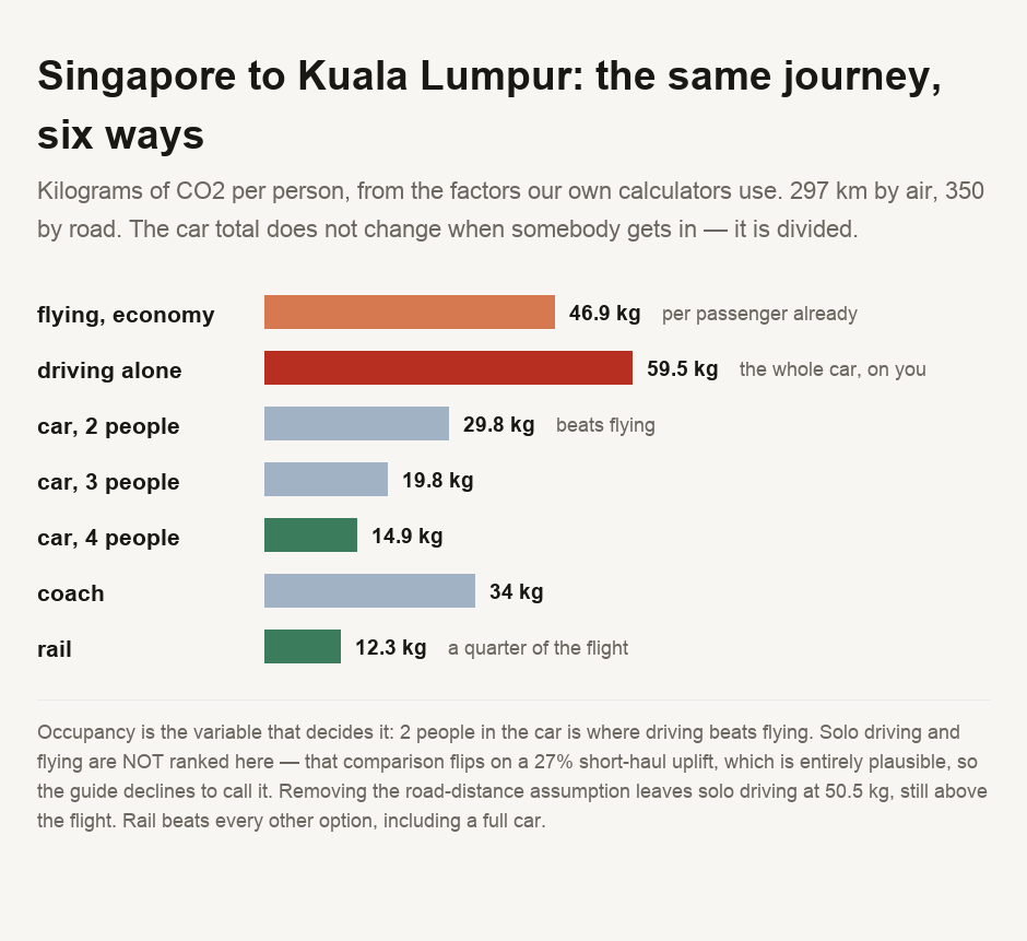
The flight is 46.9 kg per passenger. The car journey is 59.5 kg in total, a figure shared among its occupants.
Driving alone, you carry all 59.5. With one passenger, 29.8 each. With three, 19.8. With four, 14.9.
So the answer to "is driving better than flying" is 2. Not yes or no — two, the number of people who need to be in the car.
What we are not going to claim
At 59.5 kg, solo driving looks worse than the flight's 46.9. We are not going to lead on that, because we tested whether the result survives its own assumptions and it does not.
Two simplifications are built into these figures, and both skew the comparison against driving. Road distance is longer than the straight line a plane flies, which makes driving look worse. And the engine applies one flight factor at every distance, when short flights actually emit more per kilometre than long ones, because take-off and climb are a bigger share of a short hop.
Removing the first changes nothing: at identical distance, solo driving is still 50.5 kg against 46.9. Removing the second reverses the result. A short-haul emissions uplift of 27 per cent — a plausible figure — is enough to make flying worse than solo driving.
On this route, then, solo driving and flying are close enough that the final ranking depends on which modelling assumption you choose. Anyone telling you confidently that one beats the other on a short hop is over-reading the data.
What does survive
Two points survive the uncertainty, and they are the useful ones.
The first is that occupancy dominates every other variable in the comparison. Nothing else in this calculation moves the number by a factor of four; the passenger count does. A full car is substantially better than a plane. A solo driver is not.
The second is that neither mode is the good option. Rail comes to 12.3 kg per person — roughly a quarter of the flight, and better than a car with four people in it. The coach is 34.
The interesting comparison was never flying against driving. It was both of them against the train.
The core mistake is comparing a per-passenger figure with a per-vehicle one, and it produces confident answers in both directions. Correct for it and car occupancy becomes the deciding factor: on this route driving is better with two or more people, and a full car at 14.9 kg per person is far better than the plane at 46.9. Solo driving and flying are close enough that we will not rank them, because the ranking flips on a 27 per cent short-haul uplift that is entirely plausible. And if you want the actual answer rather than the argument, take the train: 12.3 kg per person beat every other option here, including a car with four people in it.
Running it for your own journey
Our flight carbon calculator and commute emissions calculator use the same factors this guide does, so you can put your own route and occupancy in and get consistent numbers. The carbon footprint calculator puts a single journey in the context of a year, which helps show that travel is rarely the whole story. And solar payback on a tropical roof is the other end of the same arithmetic — what it costs to reduce emissions rather than what they are.
- Every factor comes from
sustainability-kernel.js, the module our own flight and commute calculators run on, so this guide cannot drift from the tools it describes. Nothing is quoted from an external emissions table. - ⚠️ THE UNITS DIFFER AND THAT IS THE SUBJECT. The flight factor is per PASSENGER-kilometre; the car factor is per VEHICLE-kilometre. The car figure is divided by occupancy everywhere it appears, and the raw pair is never presented as a comparison.
- ⚠️ TWO SIMPLIFICATIONS PUSH THE SAME WAY, so the result they favour is the one to distrust. Road distance is taken as 1.18 times the great-circle distance, a stated assumption rather than a measured one. And the engine applies a single flight factor at all distances, when short flights emit more per kilometre.
- ⚠️ THE SOLO-DRIVING RESULT IS NOT ROBUST AND THE GUIDE DOES NOT LEAD ON IT. Removing the road multiplier leaves it standing; a 27 per cent short-haul uplift reverses it. Both tests are computed by the committed script rather than asserted.
- ⚠️ ONE ROUTE, CHOSEN BECAUSE BOTH MODES ARE REAL. Routes where driving is not an option are excluded — a comparison only means something when "you could drive instead" is true. The specific kilograms are for this journey and the method is what transfers.
- ⚠️ THIS COUNTS TAILPIPE AND FUEL EMISSIONS AS THE KERNEL MODELS THEM. It is not a lifecycle assessment: manufacturing the vehicle, building the road or the railway, and the non-CO₂ warming effects of aviation at altitude are all outside it. Including the last of those would move flying upward.
This compares modelled emissions for one journey using our own published factors. It is not a lifecycle assessment, not a carbon accounting standard, and not advice about any particular trip.

View author profile → · Editorial policy